How to Make a Pie Chart in Google Sheets
A pie chart shows how a total is split into parts, like a monthly budget by category. Google Sheets builds one from two columns: labels and values.
Prepare the data
Put the categories in one column and the numbers in the next, with a header row. For example, Category in column A and Amount in column B. Each category should appear only once; if the same one appears in several rows, total them first with a pivot table or SUMIF.
Insert the pie chart
- Select the data, including the header row (A1:B6 here).
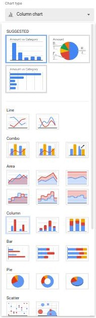
- Go to Insert → Chart. Sheets often guesses a column chart first.
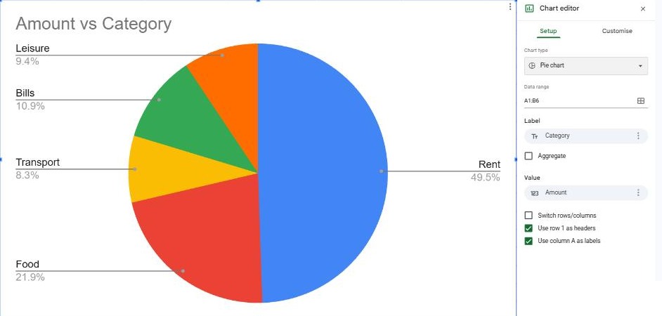
- In the Chart editor on the right, open the Chart type list and pick Pie chart under Pie. It often appears under Suggested too.
Customize the chart
Open the Customize tab (Customise in UK English) in the chart editor:
- Chart & axis titles: replace the automatic "Amount vs Category" with a clearer title.
- Pie chart → Doughnut hole: set it to around 50% to turn the pie into a doughnut.
- Pie chart → Slice label: show the percentage, the value, or the label on each slice.
- Pie slice: pick a slice to change its color or pull it out from the center to highlight it.
Frequently asked questions
Why does my pie chart have only one slice?
Sheets is probably reading your data the wrong way round. In the Setup tab, check that Label is the category column and Value is the number column, or tick Switch rows/columns.
Why are some slices missing?
Pie charts can't show negative numbers or zeros. Very small slices are also grouped into "Other" if you set a slice threshold.
When shouldn't I use a pie chart?
With more than about six categories, or when you want to compare values over time. A column or line chart is easier to read then. See how to make a chart.